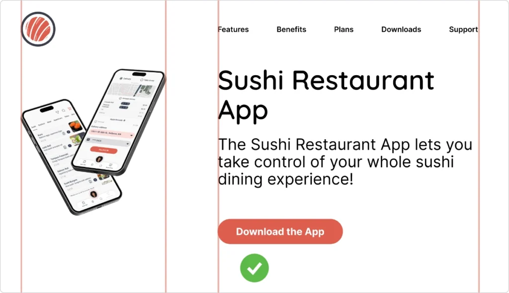
Great web design blends creativity and functionality to create a seamless, engaging experience. It starts with well-planned layouts that organize elements with purpose, ensuring a smooth visual flow. Thoughtful composition, clever photo use, and carefully chosen fonts all add personality and impact. A strong visual hierarchy keeps everything clear and easy to follow, while colors set the mood and strengthen branding. When done right, these elements work together to turn an ordinary website into an inspiring digital experience that grabs attention and leaves a lasting impression.
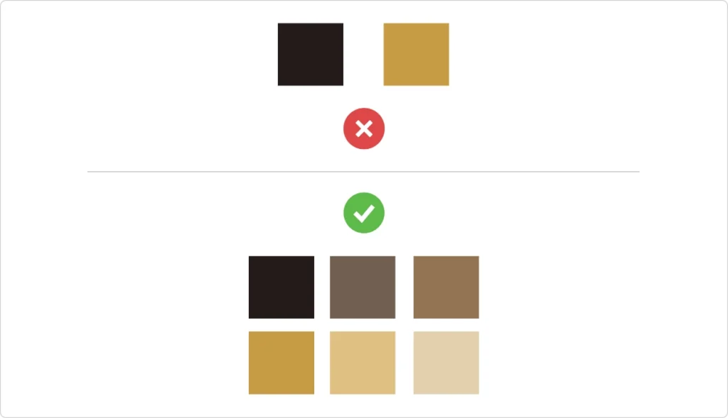
Colour
Mix in a range of shades, tones, and neutrals for ultimate design flexibility. Darken your base with black to create depth and lighten it with white to form vibrant tones. Creams, off-whites, and greys play the perfect supporting role, letting bold colors shine without stealing the spotlight. Experiment with analogous and complementary colors to keep your palette both balanced and lively. Throw in a splash of color psychology, mood board magic, and a bit of competitive insight, and you’ve got a palette that adapts to any creative twist.
Layout
A smart layout organizes information like a friendly guide, showing you exactly where to look and what to explore. When done right, it creates a rhythm, leading you smoothly from one idea to the next. But when objects are clumsily placed or details clutter the scene, it just feels off—like a room with too much furniture. The secret? Give elements space to breathe. Use whitespace not just to separate, but to evoke calm or spark urgency when needed. Proper alignment creates a sense of order and beauty, while grids provide structure and balance.
Composition
Graphic designer Robyn Williams nailed composition with four simple rules: Contrast, Alignment, Repetition, and Proximity (CARP). Contrast is the showstopper, making sure important elements jump off the screen with bold colors, unique shapes, textures, and use of space or size variations. A clear focal point keeps your eyes on track.


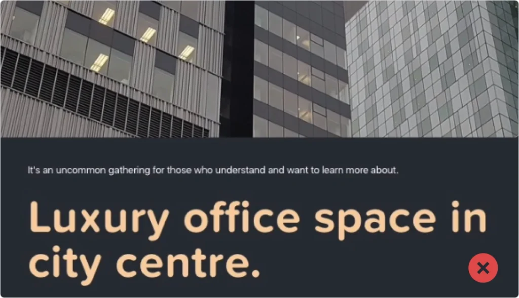
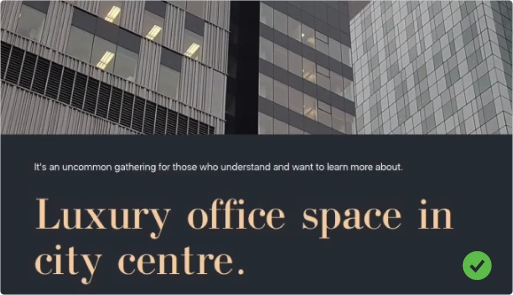
Typography
Choosing the right typeface is like picking the perfect outfit—it sets the tone for your whole project. There are four main families: Serif, Sans Serif, Expressive, and Script. Serif fonts evoke a classic feel. Within these Old Style lends a timeless look, Modern offers sleek flat serifs ideal for upscale brands, and Slab delivers a bold, boxy vibe. They work wonders for headlines but can overwhelm longer text. Sans Serif is the safe, everyday choice, effortlessly balancing style and readability in both small text and headlines. It comes in various flavors—from the playful to the serious. Finally, expressive fonts burst with personality and they’re best for headlines that need to grab attention. Then there’s Script, a nod to handwriting, charming yet best used sparingly to add a touch of flair.
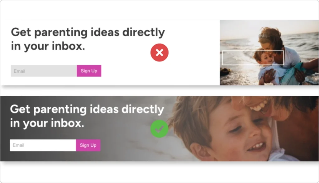
Photography
Overlays create depth and texture without stealing the show, while the rule of thirds creates a harmonious feeling and draws attention to the subject while emphasizing the surrounding elements. An extreme crop can inject drama and focus, whereas a soft crop offers a gentle touch that eases the viewer in. And symmetry? It brings a sense of order that can transform chaos into calm. Experimenting with these techniques turns ordinary images into powerful storytelling tools for your digital space.