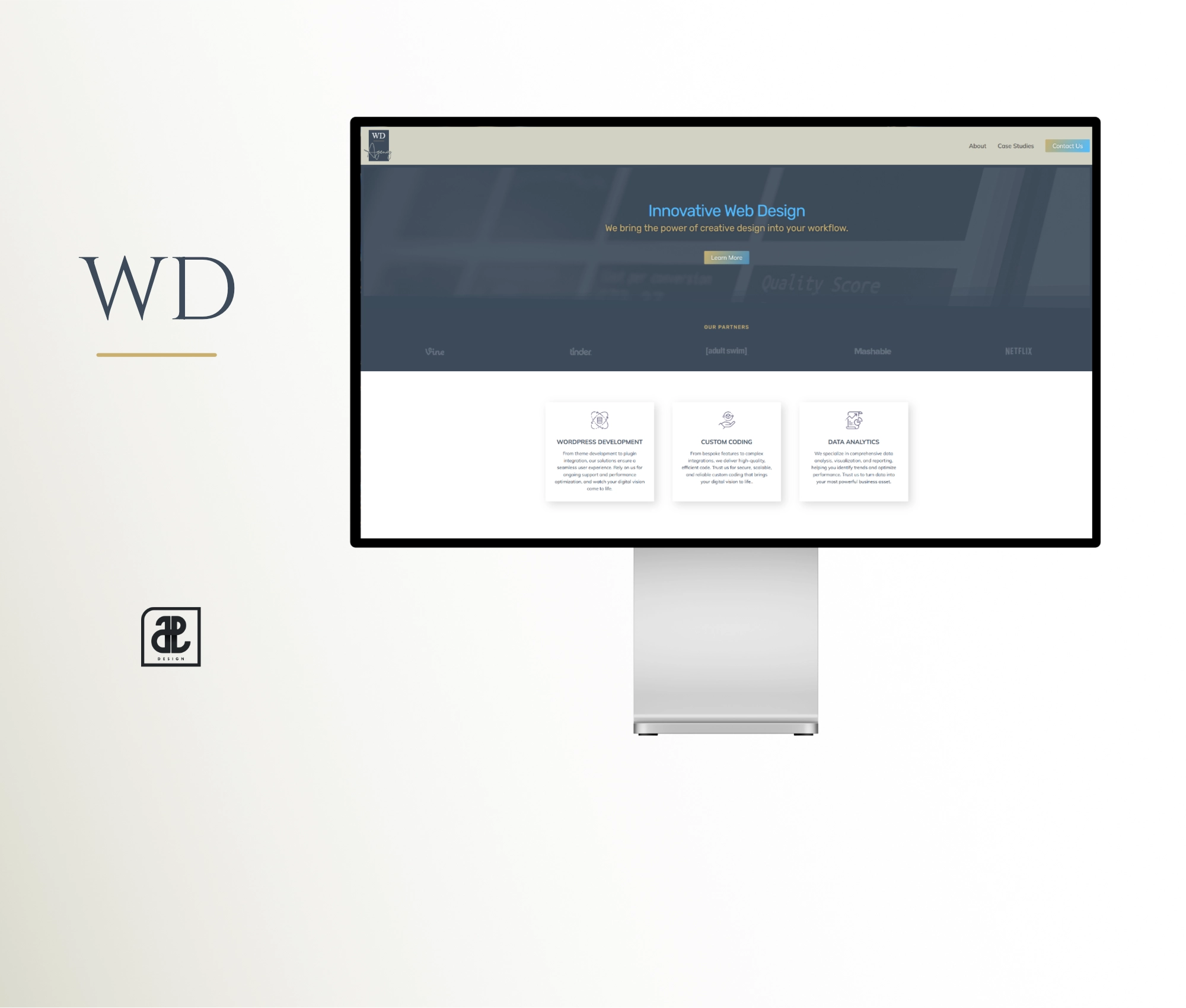
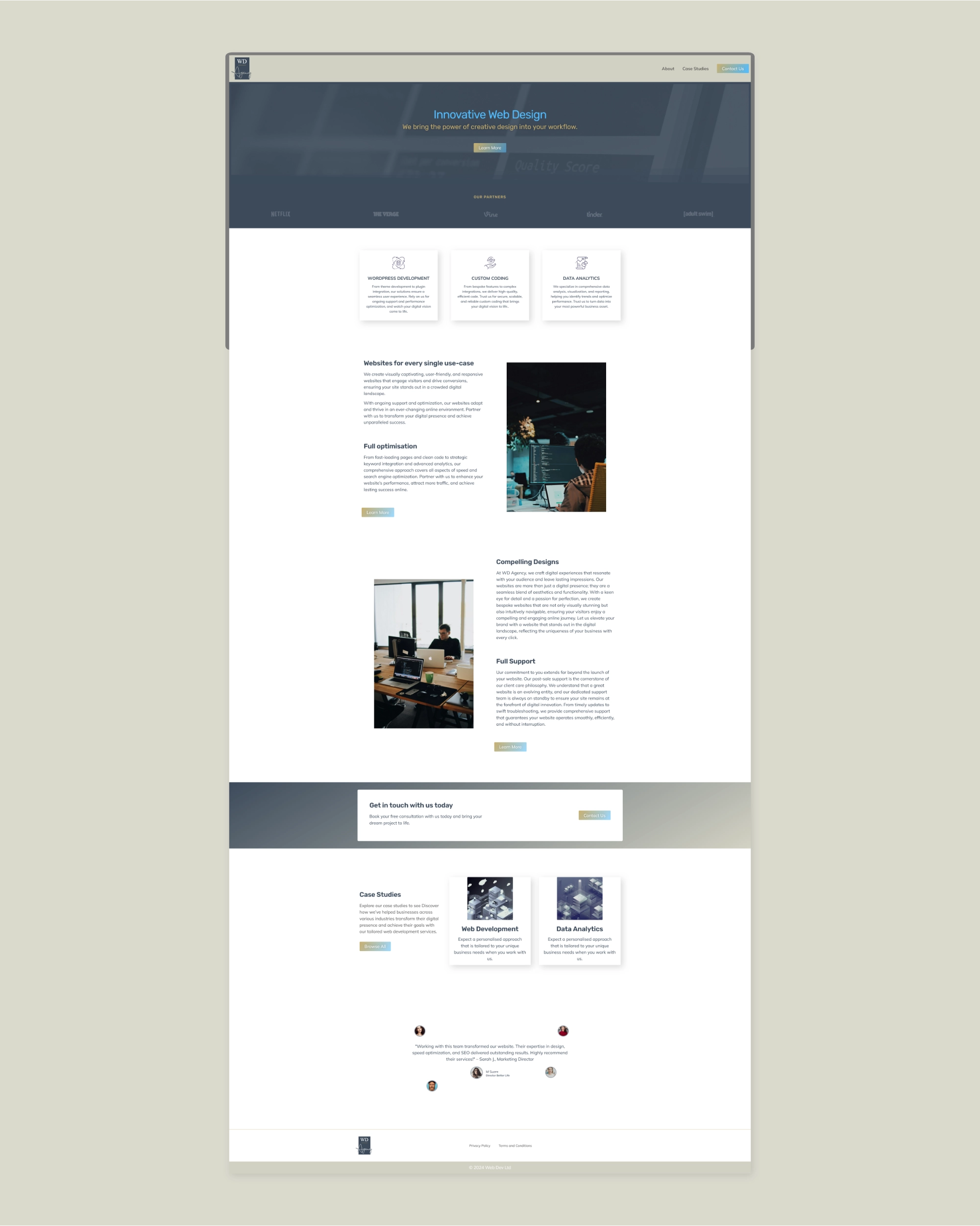
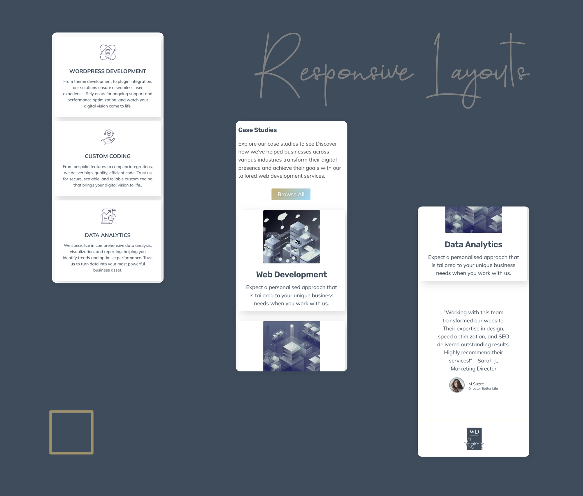
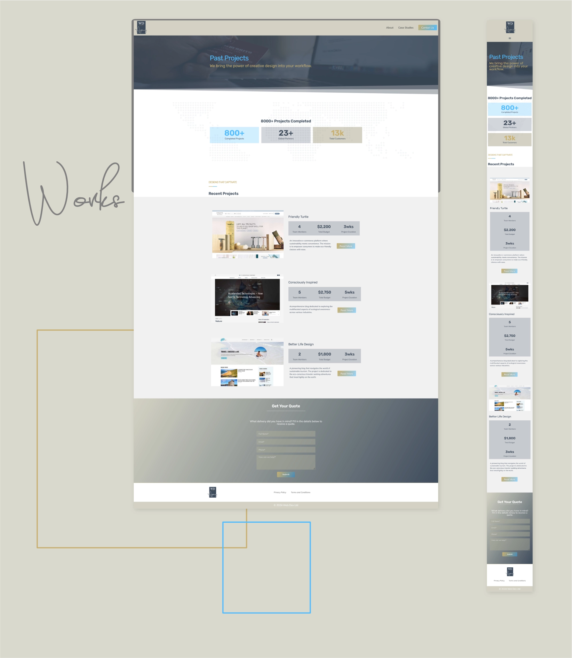
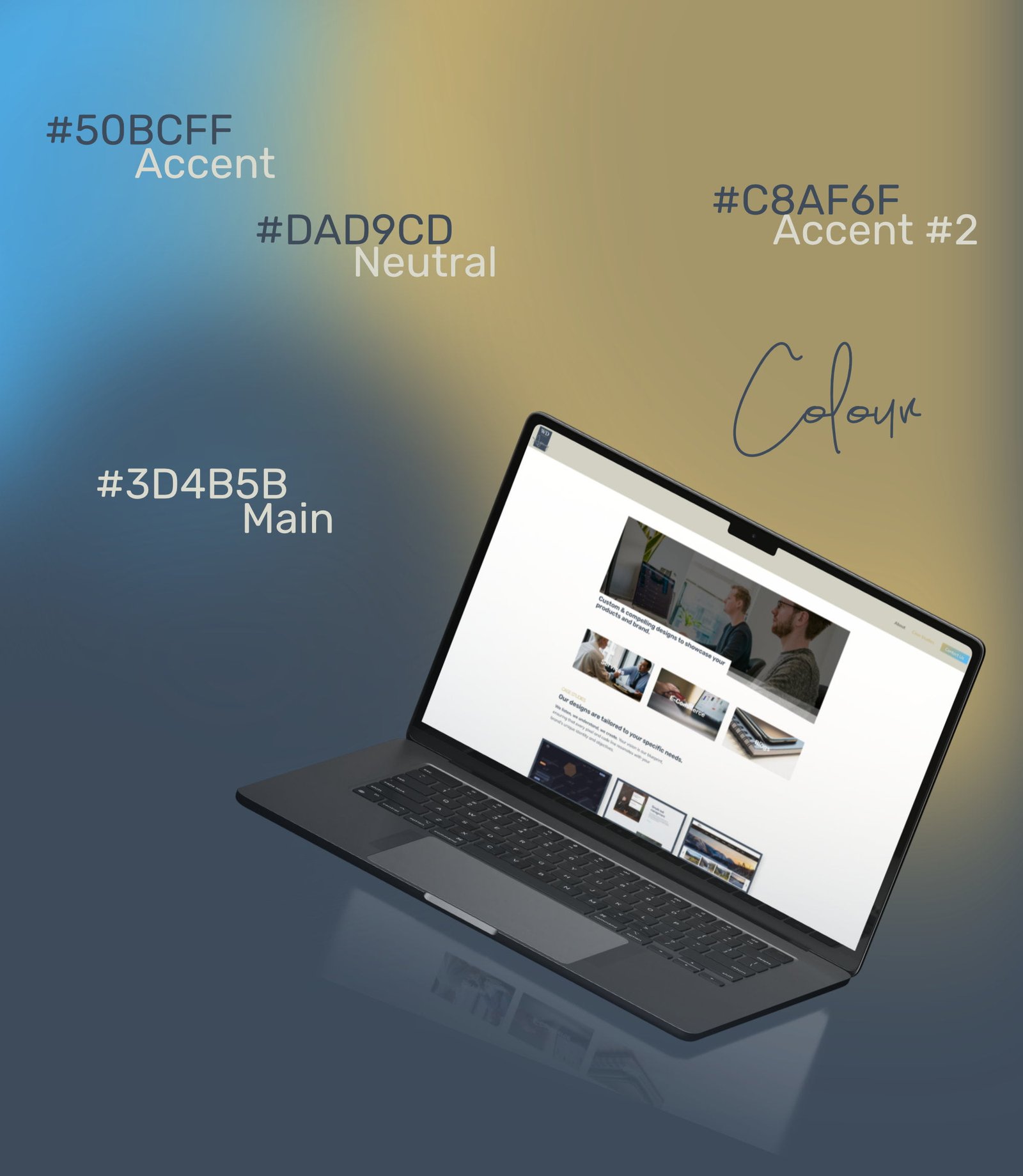
As you enter WD Agency’s web design domain, you’re embraced by an aesthetic that’s both sleek and substantive. The brand is woven into every element, from the harmonious color scheme that speaks to the design finesse, to the interactive elements that stand as pillars of the user-centric approach. The layout uses clean white space, structured sections, and harmonious typography to highlight the agency’s services, client testimonials, and portfolio pieces. Key content blocks, such as “Websites for every single use-case” and “Case Studies,” are accompanied by high-quality imagery and concise descriptions, ensuring the information is digestible and visually engaging.
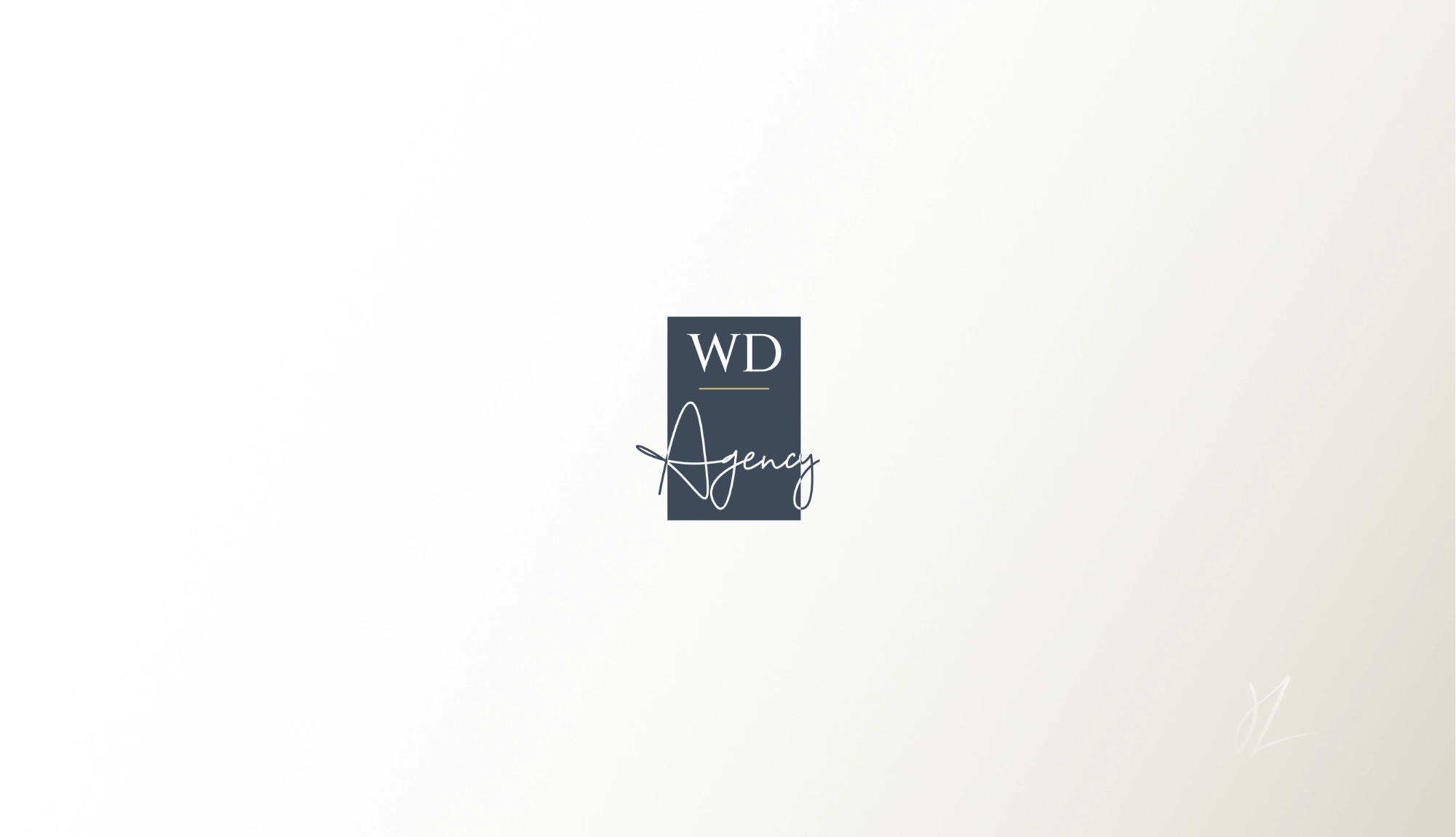
The “WD” serif logo conveys a sense of steadfastness, elegance and tradition, reflecting the agency’s strong foundation in web design principles. This is juxtaposed with the word “Agency” written in a cursive, handwritten style, which adds a personal touch, suggesting an approachable nature and commitment to bespoke solutions. Finally, the dark blue and gold color scheme exudes professionalism and quality, while the light grey background offers a canvas that makes the logo pop—inviting viewers to delve deeper into what they stand for.
WD AGENCY WEB DESIGN
- 2024