Aesthetic appeal isn’t just a matter of taste—it can be measured, and it makes a real difference in how people use your site. When something looks good, users tend to believe it works better, too.
In the early days of mass production, ornamentation helped cover up flaws and ease people into unfamiliar technology. The same logic crept into early web design. Apple introduced skeuomorphic elements, where digital icons resembled real-world objects, making interfaces feel cozy but sometimes convoluted. Microsoft countered with flat design—simple, bold, and modern—yet users occasionally missed the fact that some images were buttons. Neither approach is inherently more functional. Google’s “almost flat design” treads the middle ground, keeping a sleek look while still guiding users.
Research shows that user perceptions of color schemes, complexity, and layout influence how easy a product feels to use; and while cultural preferences vary, simplicity wins out in most corners of the globe.
If your website is still lost in the digital dark ages, it’s time for an upgrade. A clean, modern design not only looks professional, it also builds instant trust with visitors and boosts engagement.
Next up: the steps you can take to start a sleek, user-friendly redesign.
Plan with Purpose
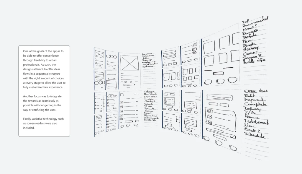
Stop designing in the dark: a solid website must serve your operational needs and offer visitors an intuitive, accessible experience. To get there, you need to focus on three things: accessibility, usability, and content delivery—across every device and platform. But first, nail down your approach by creating realistic user personas that capture the true essence of your audience. That way, your designs stay empathetic and user-centric. Next, decide which content matters most, organize it smartly, and wrap everything up in a layout that’s both seamless and striking.

Adopt a Minimalist Mindset
A Japanese proverb says a garden is complete only when there’s nothing left to remove. The same spirit guides minimalist design. Strip away distractions, spotlight the essentials, and let beauty shine through simplicity. But be careful—if you pare down too much, your design risks feeling soulless and lacking personality. The real trick is finding that sweet spot between clarity and character, so your site remains both elegant and inviting.

Responsiveness and Load Speeds
Designing a truly responsive site means adapting every element—text, images, icons—to fit any screen, from sprawling desktop monitors to the smallest smartphones. When you optimize layouts and scale down content smartly, you’re not just improving aesthetics—you’re also boosting performance. And in today’s “now or never” digital world, speed isn’t a nice bonus—it’s a deal-breaker. If your site drags its feet, your users will tap away faster than you can say “loading.”
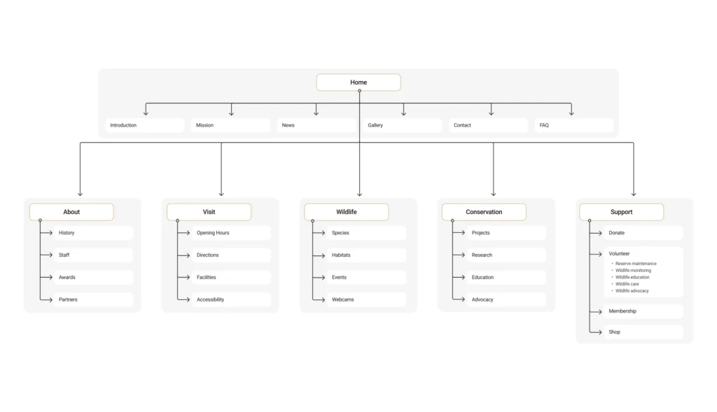
Establish Hierarchy and Navigation
Think of your website like a well-organized library—you want visitors to find what they need without wandering through endless shelves. Nail down your main content structure early, so you don’t wind up with cluttered, confusing menus. Whether you group content by tasks, categories, or user types, it’s all about meeting expectations and using clear, straightforward language. The goal? A site layout so intuitive, your audience barely has to think about how to get from point A to point B.
Ensure Brand Consistency
Striking the right balance between familiar design patterns and your own creative spark is key to crafting memorable user experiences. Keep what users already love—intuitive layouts and recognizable navigation—while adding distinct touches that represent your brand. And don’t forget: a solid design system or branding guidelines will help everyone stay on the same page, ensuring consistency and usability across your entire site.
Test, Test, Test
Nobody nails it perfectly the first time. That’s why continuous testing and measuring are so essential. Analytics show you exactly what users are up to—where they click, how long they stick around, and which pages they bail on. From there, A/B testing lets you pit two designs (or persuasive approaches) against each other in a friendly duel to see which one triumphs. And don’t forget usability inspections: they can uncover those sneaky pitfalls you’d otherwise miss. The result? A site that keeps on improving, one test at a time.